Awareness: Marilyn Minter
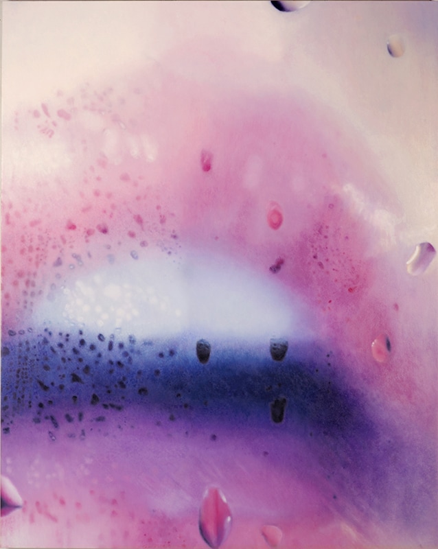
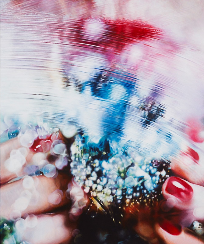

This is Marilyn Minter <http://www.marilynminter.net/paintings/> whose paintings remind me a lot of Amanda's work. They're a lot of realistic images of women's body parts but they're blurred or seen through glass. It's content makes me think about the modern objectification of women, and how the bodies of women are treated a bit like commodities to be sold or to be advertised to. It's interesting content that really needs to be explored, but I love how the colors and forms interplay in these works. I love playing with realism in my work, and I really like how she uses it here.
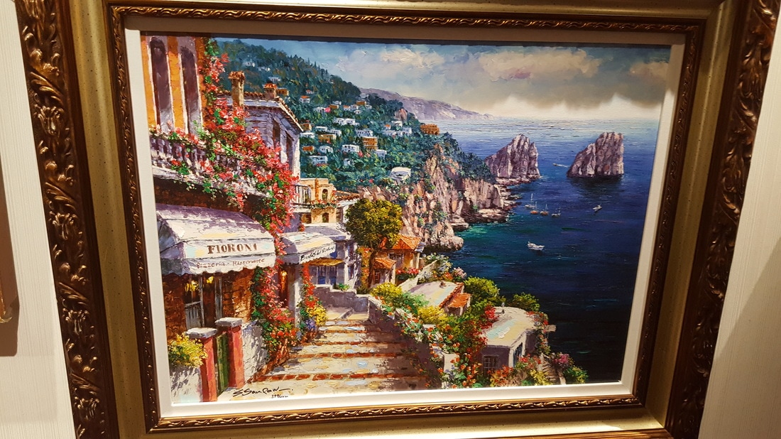
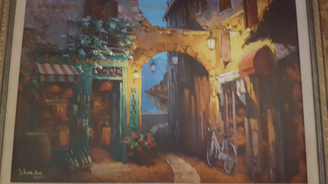
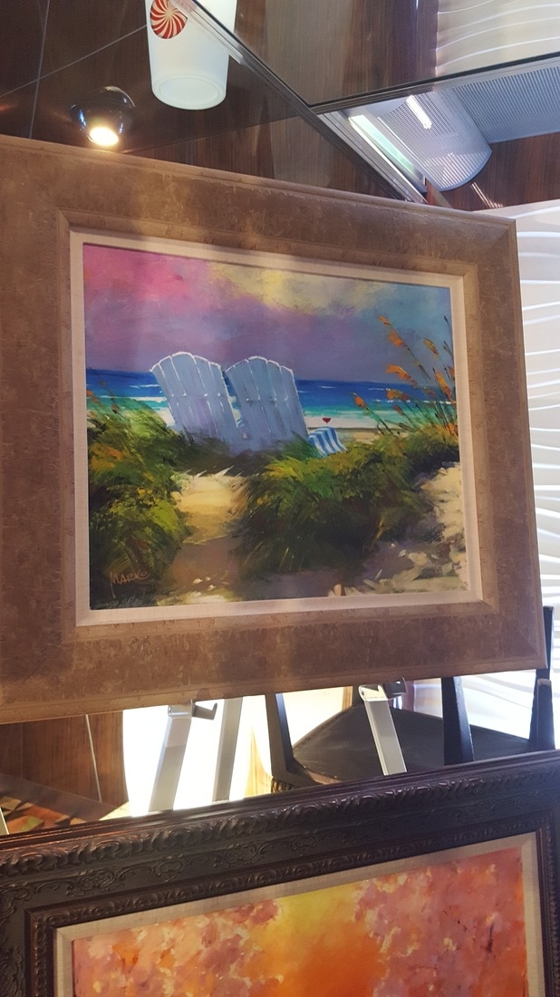
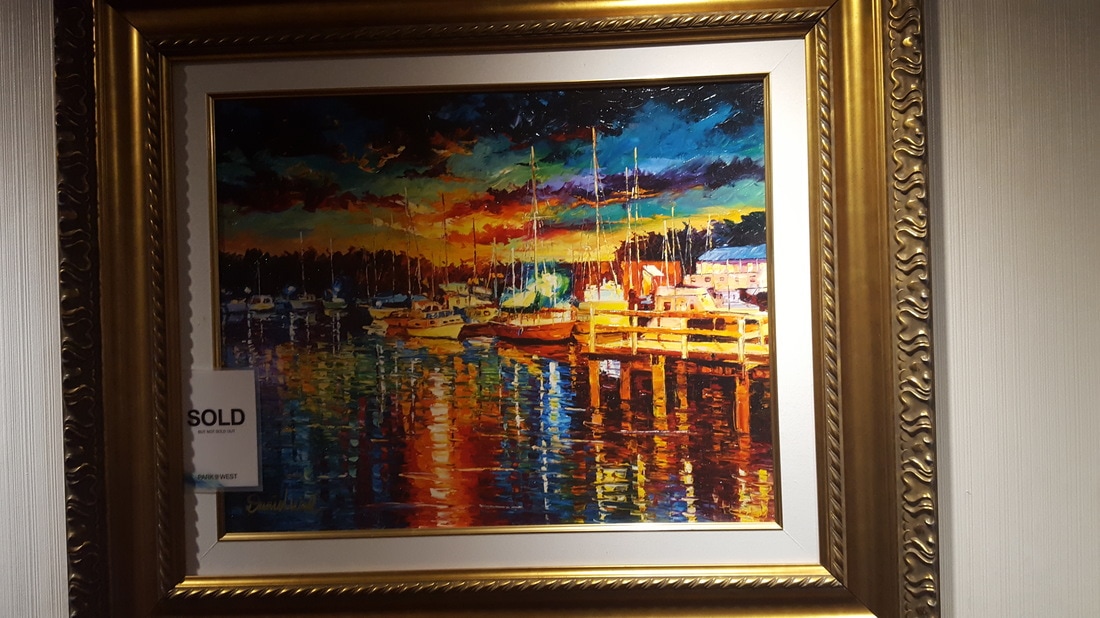
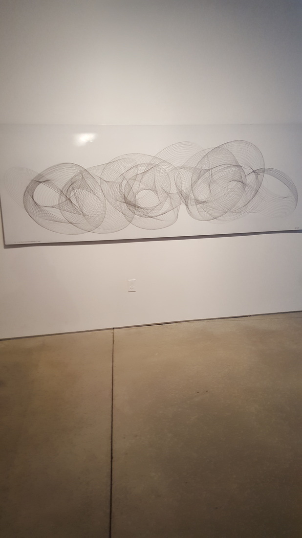
Awareness: Sam Park and Marko Mavrovich
Another set of artists I saw on the cruise! These works are really beautiful almost impressionist landscapes. And really again I love looking at the way they capture the light and color in a scene to convey a mood. These aren't as bright as the intense impressionists I looked at earlier, but their work is more tranquil to me, and a bit more real. I really love the reflections in the water and how the paint seems to reflect light so accurately.
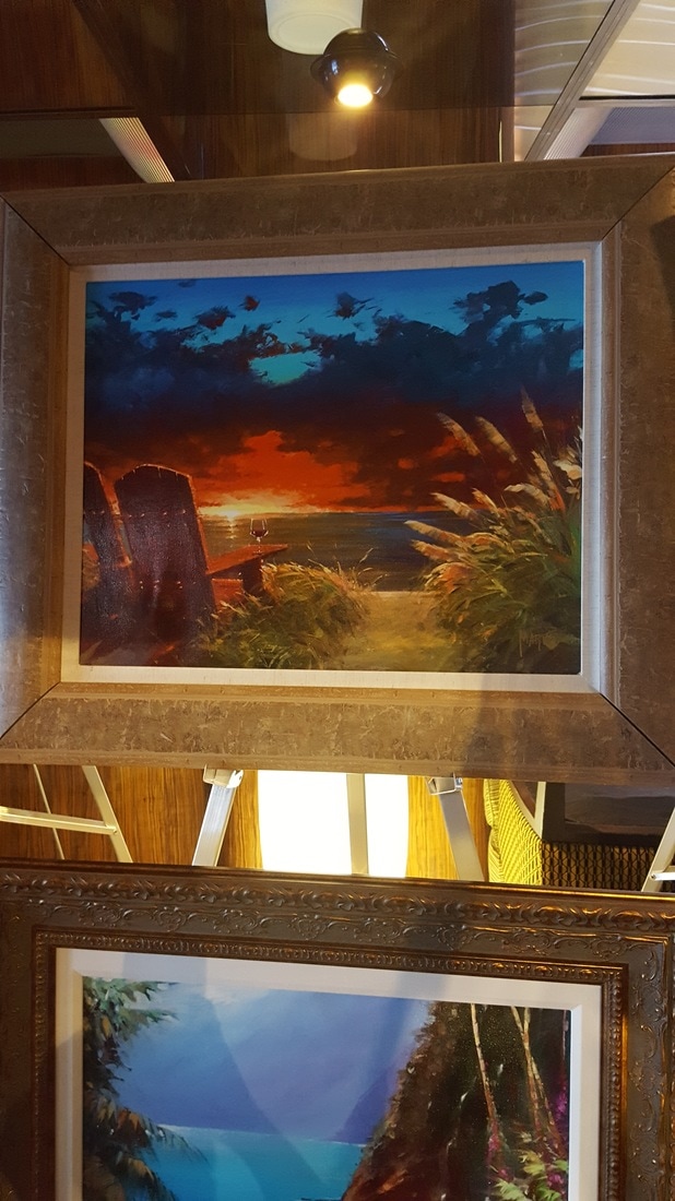
Awareness: Daniel Wall and Slava Ilyavev
I saw these contemporary paintings on a cruise art auction and I honestly love them so much. The colors are so bright and intense, which is obviously why the style is called "Intense Impressionism." I love how the colors create such a vibrant and extreme mood in the paintings, and it really speaks to how I love to use color in my paintings. These artists' works are very beautiful and I want to continue exploring how to use color and movement in my own art.

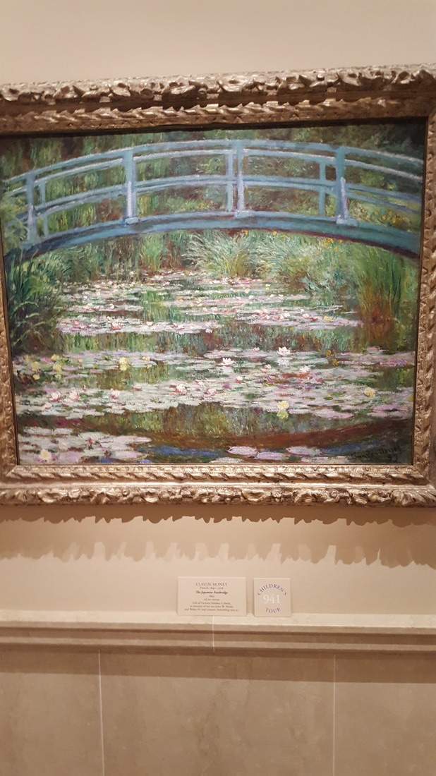
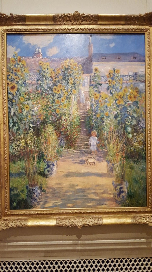
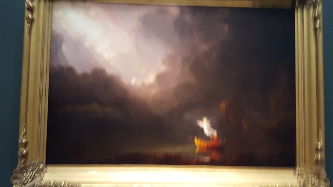
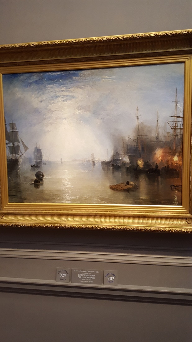
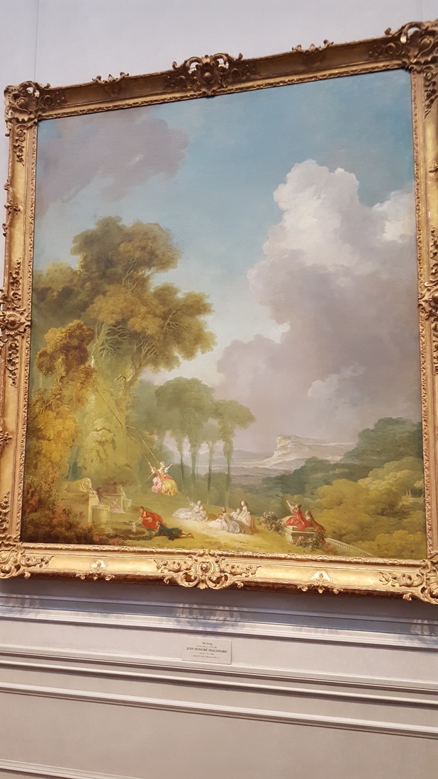
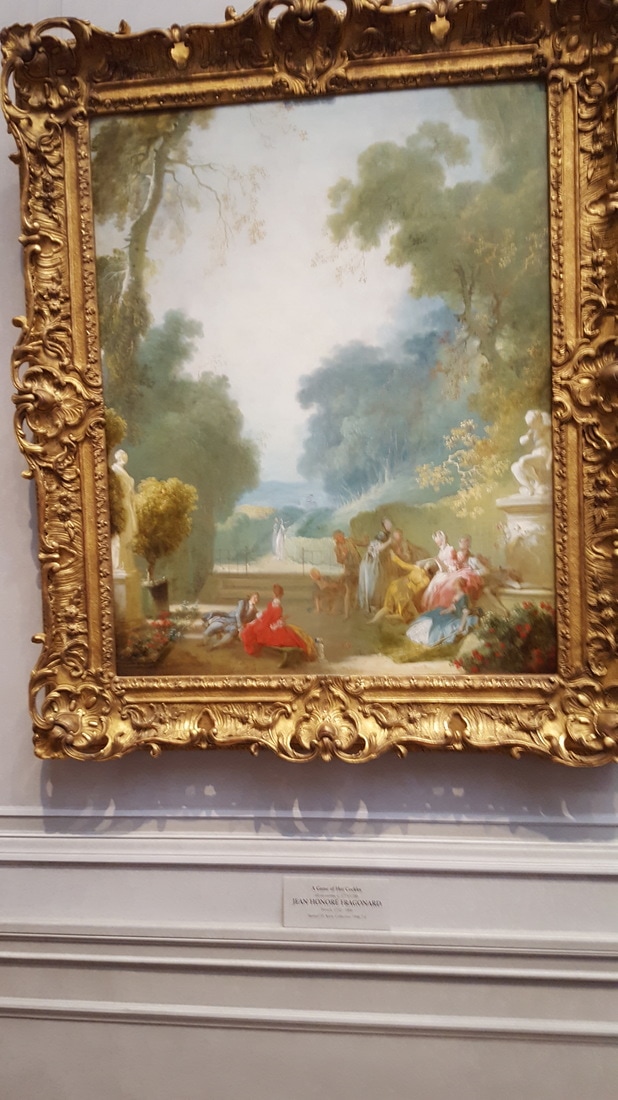
Art Seen: National Gallery of Art, DC Fieldtrip
Even though we saw a bunch of contemporary art in DC, my favorites are always the older classic ones. I loved seeing more of Monet's work but I also realized I really enjoy landscapes. Like Turner and Cole, their landscapes are so beautiful and kind of atmospheric. Also, I really liked Fragonard's work. Rococo is a really interesting style that I'd love to look into more.
Awareness: Khara Ledonne
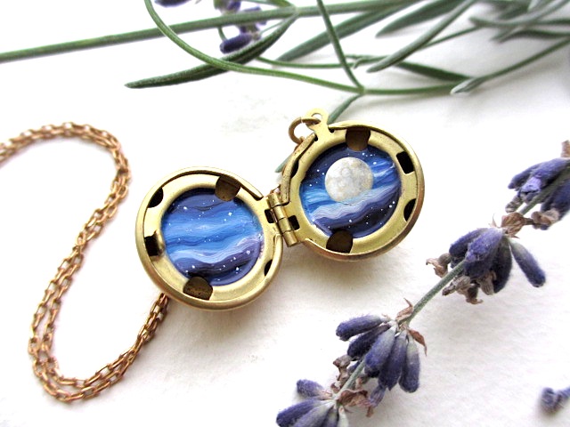
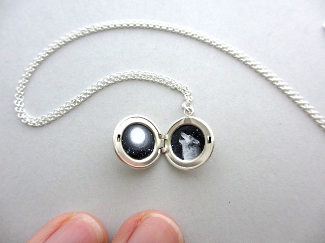


I love these lockets and the tiny designs in them, especially the space themed once. Ledonne puts a lot of work into the pieces of jewelry by enamel painting the details in these tiny metal lockets. I also really like the content I can see behind these. It might not be the exact intended content, but I really like the idea of taking something so vast and expansive and cosmic like the universe and condensing it and all its details into a small personal locket, something you carry near your heart. I really the idea of carrying something so heavy and awe-inspiring in an intimate locket, it gives the pieces a lot of weight for me.
Awareness: Scott Naismith
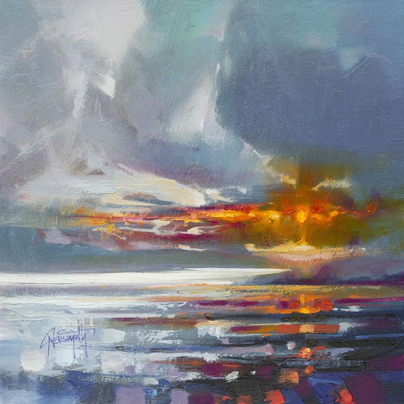
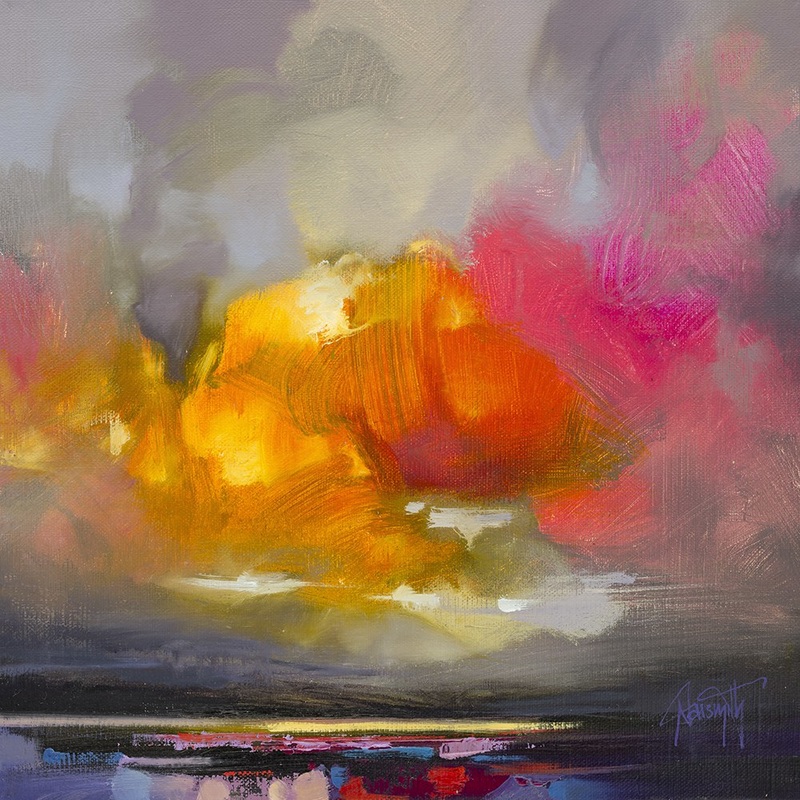
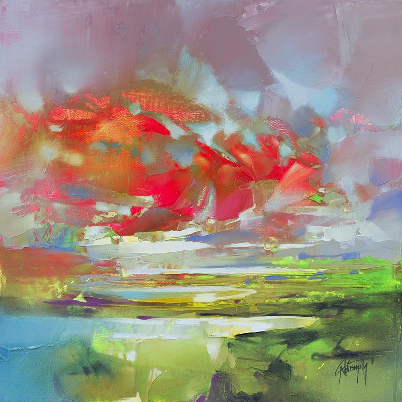
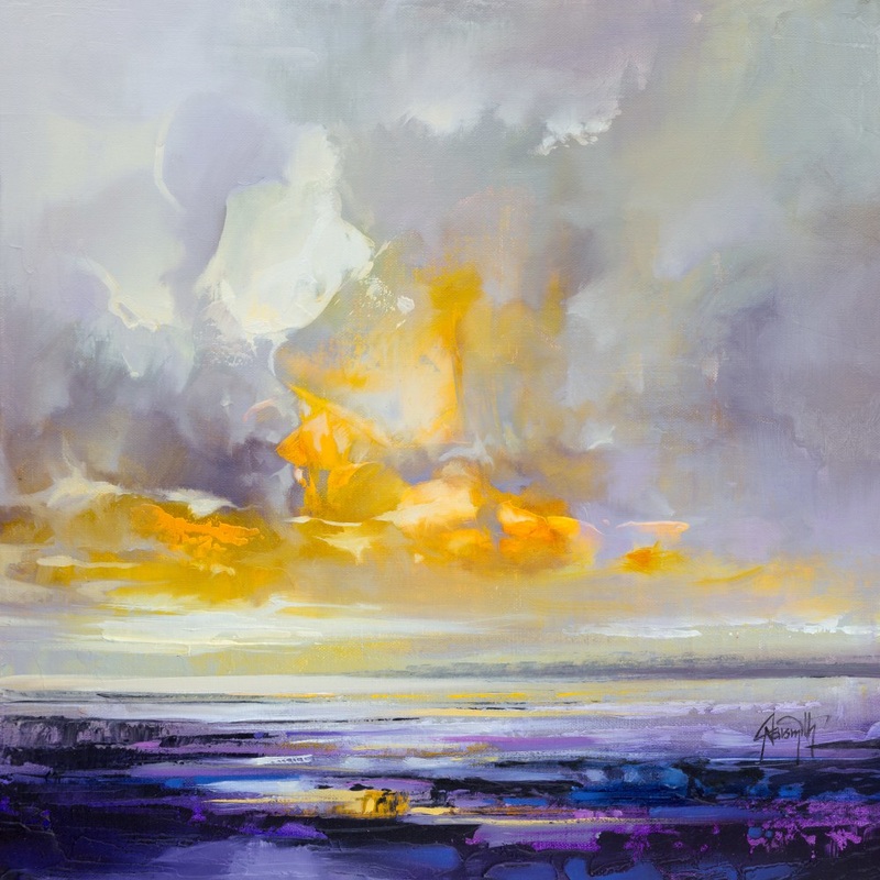
Naismith has work that gives me the same vibes as Kopania in that he uses these bright swaths of color to paint the skies in his landscapes. I really like this because I want to learn how to use color better and maybe get into representing the sky and the seas using these big blocks of color, and not being afraid to do so. Even with watercolor, I try and leave everything blended and I want the colors in my backgrounds to seem "real," but I would love to try and incorporate some of this more abstract, but still recognizable way of representing things. As a sidenote, I am really inspired by his artist statemen he really wants to play with the weight and color of clouds and how they interact with light, water, and the atmosphere to create complex color and light patterns, and he's very inspired by "Turner, who created ephemeral atmospheric effects."
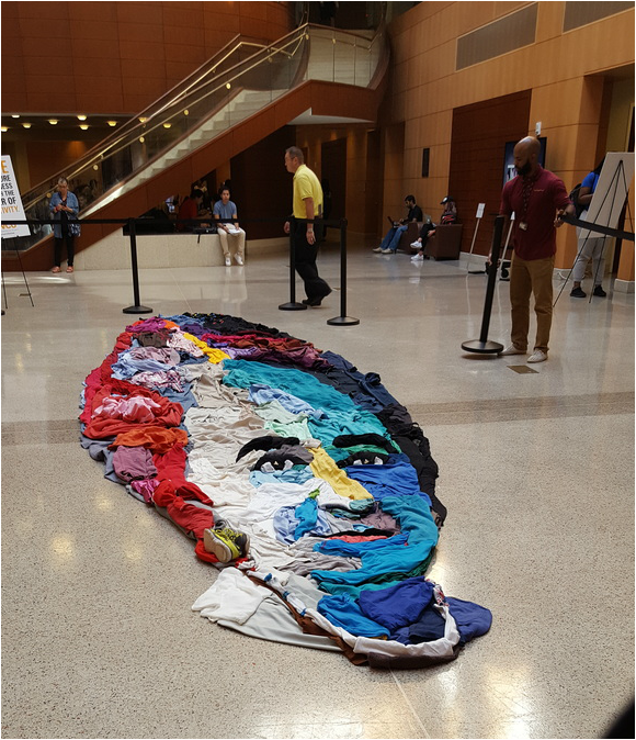
Art Seen: Noah Scalin Installation
|
The installation was really cool, but I think the best part was actually seeing the artist talk about his work in front of it. His explanation of the content behind the installation really resonated with me. He talked about how putting art in a business school "seems like the wrong place," but that's why he wants to do it. When you first walk in, you think it's like a fish or boat or something, but then you walk around it and have an "OHHH" moment. You have a literal change of perspective, and see the clothes for the image they make. He wants to show people how to look at the world and possibilities in a new perspective.
|
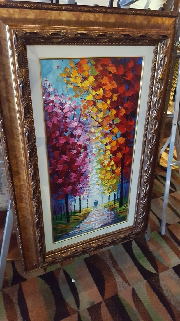
Awareness: Justyna Kopania
|
|
|
This artist's work is amazingly beautiful and it also really encompasses some things I love about painting. She paints seascapes and ships on the sea, among other things, in these beautiful oil on canvas works. I love the colours in the works; many of them have monochromatic elements with various shades of blue, but with additional hints of orange and yellow, so like a complementary scheme, or sometimes primary. Every now and then, the sky gets green and cloudy with browns and other earthy tones, but still capturing the essence of the seascape.
I really love the texture Kopania has in the skies of her works. Like the strokes of paint are so large and thick and direct, but they are done so well and blended and coloured to make the work so cohesive and textured and interesting. Especially in the ship paintings, these strokes and textures work really well with the direct thin lines of the ships. And the realistic reflections in the water are also breathtaking.
Honestly, I think I could learn a lot from her work; much of the time, I have problems tying my work together with a background and making it interesting visually but also realistic. I like both realism and abstract elements and I want to reconcile them in my works. Kopania's thick paint strokes are amazing and make me consider how I can think about texture and background in my art.
https://studiounderthemoon.zohosites.com
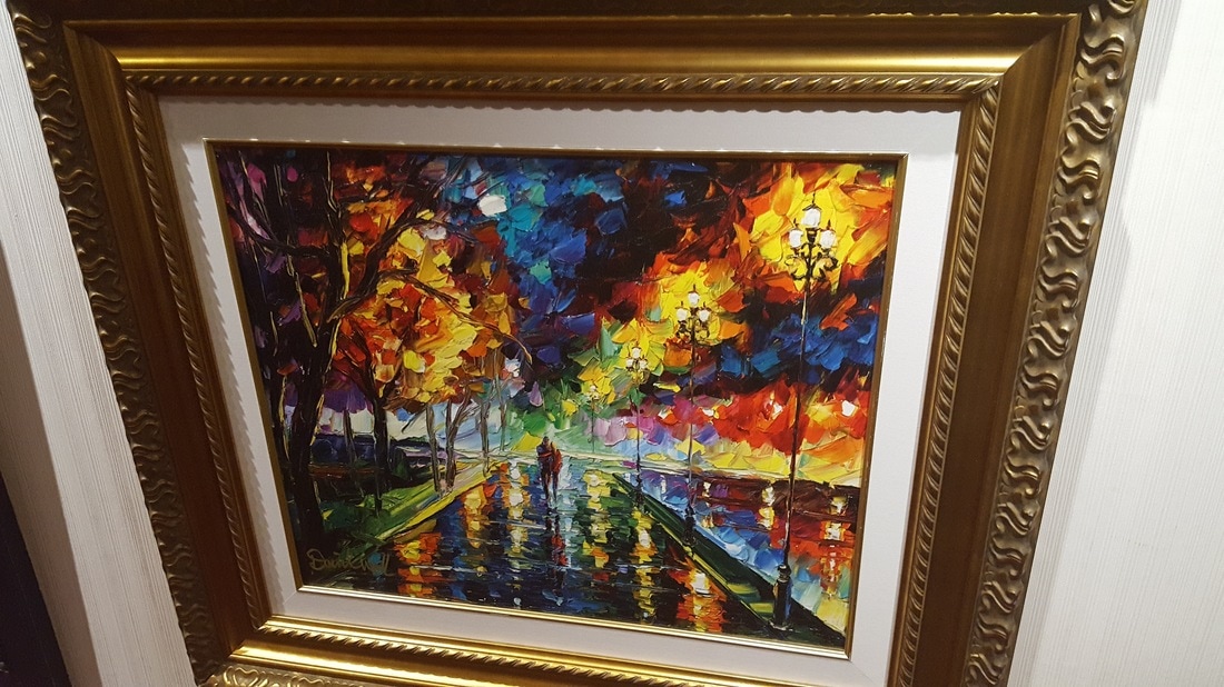
Awareness: Georgi Petrov
Much like Justyna Kopania, this artist also uses really thick brush and slided areas of paint to make scenes and things like that. Petrov is different to Kopania because his art seems less realistic to me, but still amazingly cool. Many of the forms in his works are implied by the heavy swaths of paint, and the colours work really well and brightly. What I find very interesting, is that there's a weird sense of background created by the faded skies and backdrops on the paintings. It's slightly counter to Kopania because her backgrounds were like how his foregrounds are. This is a really cool thing, because it makes the eye focus on the different shapes that imply forms in the foreground.
Again, I really like this because it's a semi-abstract way that portrays scenes in a realistic fashion. Also, I love again how to colours play though in the works and complement each other. I'd like to learn how to make my colour schemes as beautiful and complex, along with working on how to use abstract elements to imply reality in my work. Additionally, I think Petrov's work makes me think of my background and how to make it interesting and cohesive with my piece.
http://georgipetrov.com/en/about/
Art Seen: VCU Grad Students
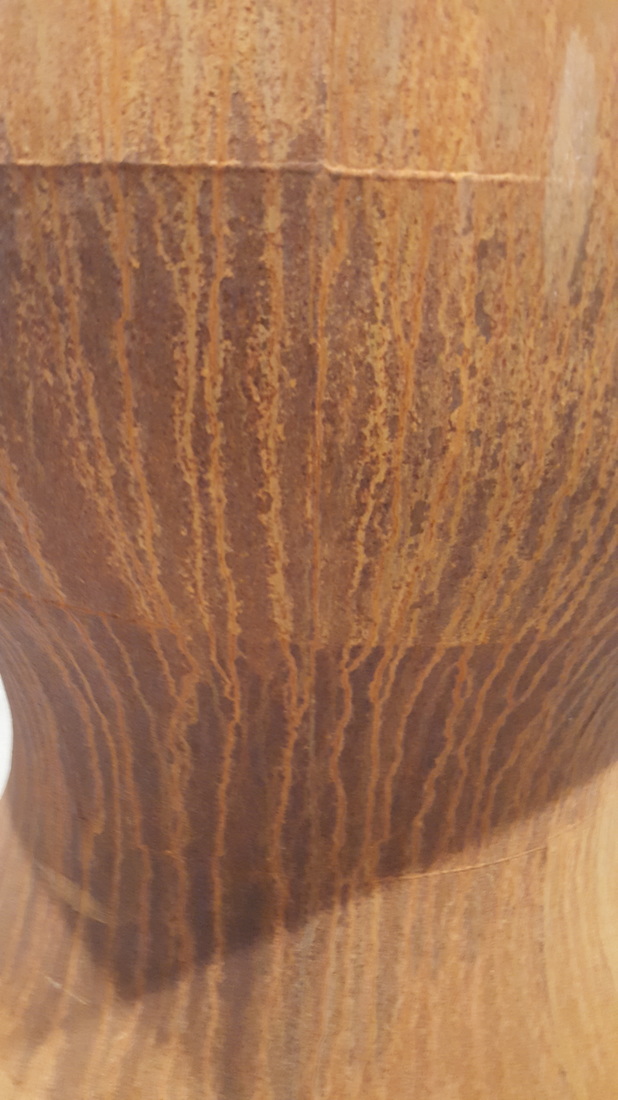
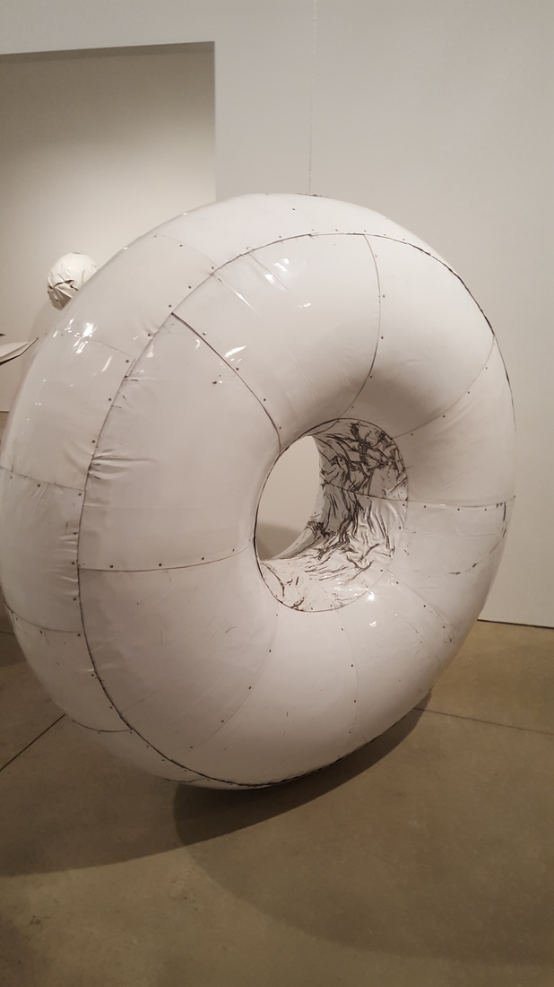
Seeing a bunch of art from VCU grad students was really cool. A lot of the art was really different in different departments and mediums, but even so it was very enjoyable. Some of my favourite pieces were: sculptures that were made out of sandalwood and rosewood that you're supposed to rub and interact with, sculptures with the Islamic coverings on them and the video where people playing them were doing things like playing baseball, and metal things that changed shadows when you change the lighting. All of those were really cool, but there were also a lot of paintings in a room arrangement and other types of interesting art.
It overall was really cool because it showed me how a bunch of different work could be represented in the same space but not look disjointed and disparate. Also all the work was presented really professionally so it makes me think about my presentation of my work. It was really cool to see and a lot of fun.
It overall was really cool because it showed me how a bunch of different work could be represented in the same space but not look disjointed and disparate. Also all the work was presented really professionally so it makes me think about my presentation of my work. It was really cool to see and a lot of fun.
Awareness: Nicolas Jolly
I learned how to paint first with watercolor, it was my first medium and even thought I don't have any watercolor paints, I still love painting with it when I can and i'd love to learn how to get better with it. Nicolas Jolly focuses on ink, but I was really drawn to his watercolor paintings. I love how some of them are more realistic and tight, but many of them are very loose and less hard-edged. That really is a difference in style that still works, because of his unifying theme of the city. It's another artist that has the theme of city and I find that really interesting. In addition, his website says he likes to work with composition, making the eyes move around the different elements of the piece and I think that's really cool because I'm also trying to work on making my compositions more dynamic and complex. I just really like his whole theme and style that unifies this portion of his works, I'm trying to work towards a motif or idea or style that brings my work together and I think this artist really inspires me to think about that.
Art Seen: Full Circle: Steve Hedburg
We took a walking field trip to see two different shows and I think this one speaks to me most. His work is very similar to things I really respond to. It's based in realism but it incorporates abstract elements into it through colors, lines, and shapes around the realism. I love his work because it's all so different and interesting, but it's all connected by the abstraction and realism that weave into the style. I also really like his theme of "city" and I can see it come through in many of his works. I don't necessarily have a very deep connection to any place or city, but I can really see his theme in his work, and I also aspire to have a strong unifying theme in my work like he does. Overall, I really like his work but it also gives me a bit of hope, because he's combined things I really like into a unifying set of work that looks really good, so I hope I can do that too with my ideas.
Awareness: James Reads
I love this artist so much, because I love Van Gogh’s mark and style and James Reads really captures the beauty of it perfectly. I’d really love to use Van Gogh’s mark in my work but I thought it was going to be cliché or silly, but James Reads does it in a new way that actually looks really interesting and cool.
I think I really love stuff like this because color and mark makes it really interesting to look at and think about. The composition is also really dynamic because the mark makes my eyes move all over. Some of my personal favorites are down below.
I just really hope that I can learn how to use marks and styles from things I really love while still keeping my own sense of artistic individualism.
www.jamesreads.com
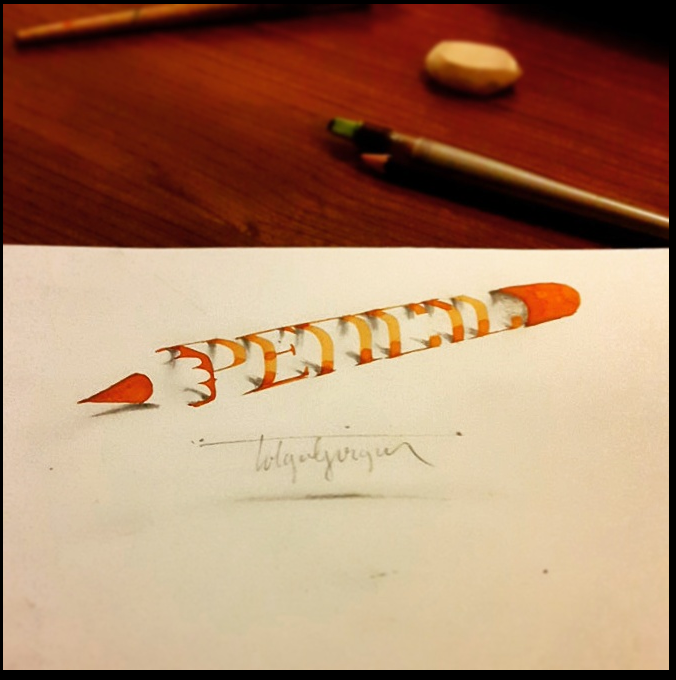
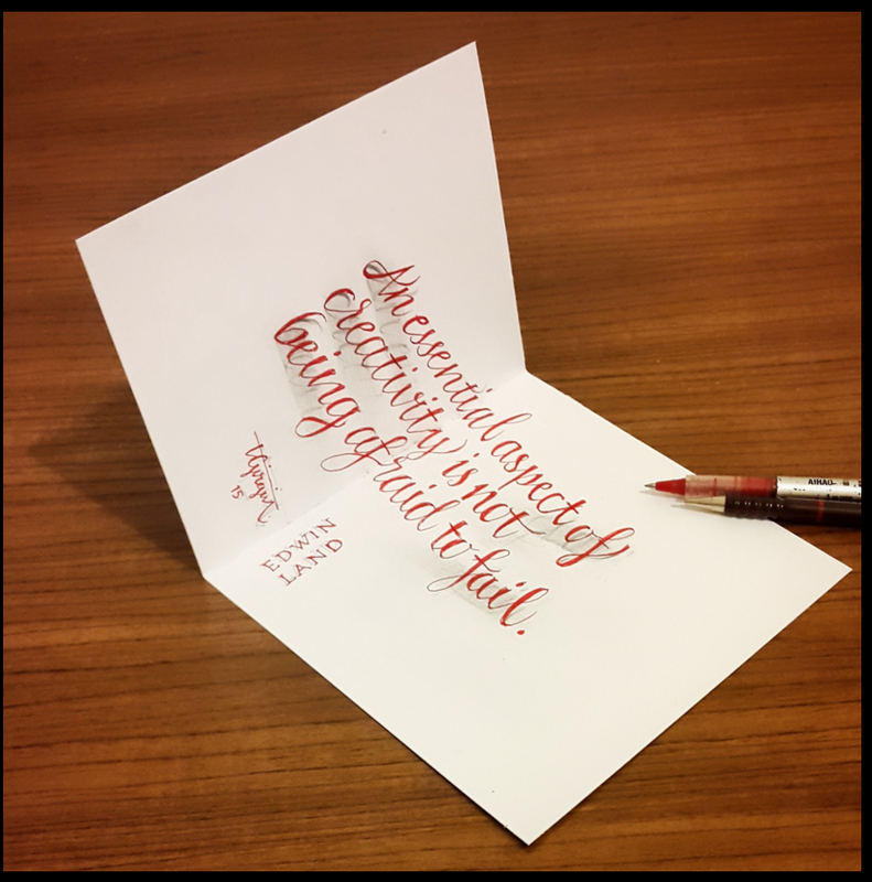
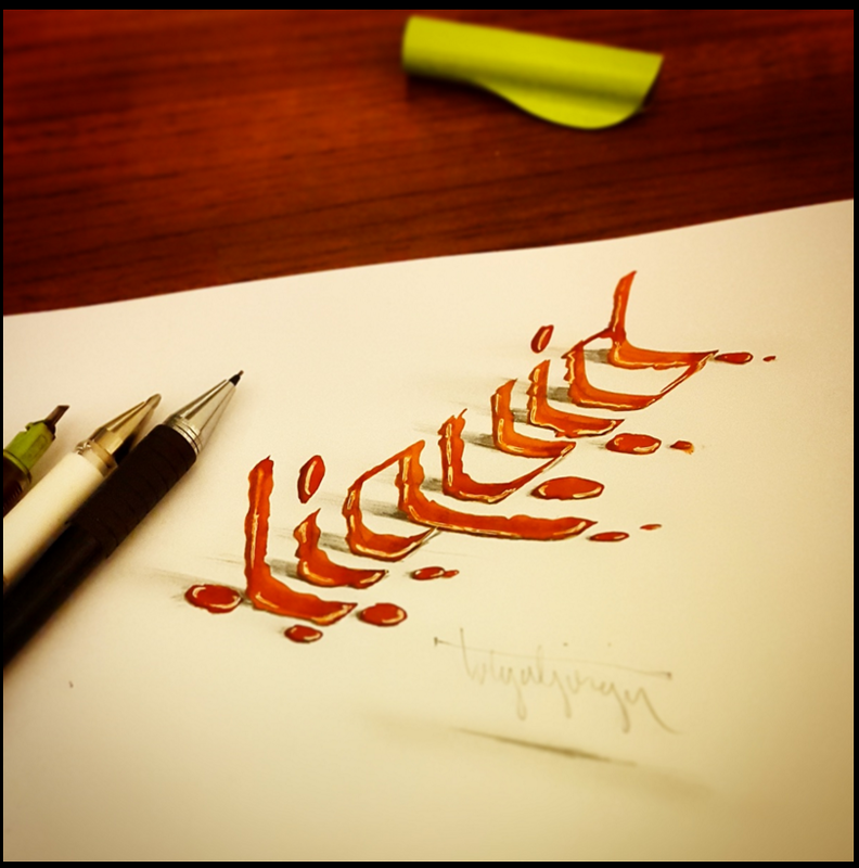
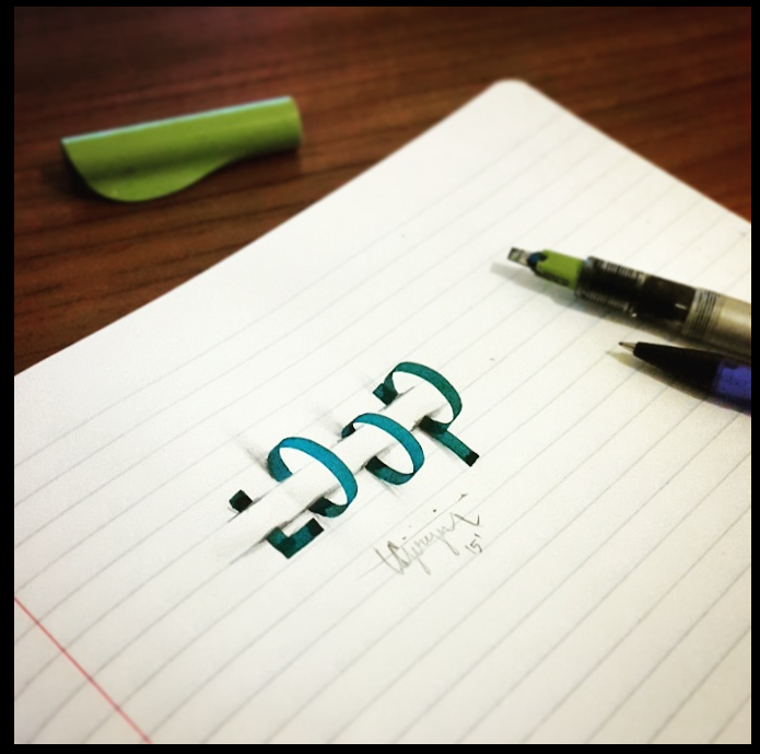
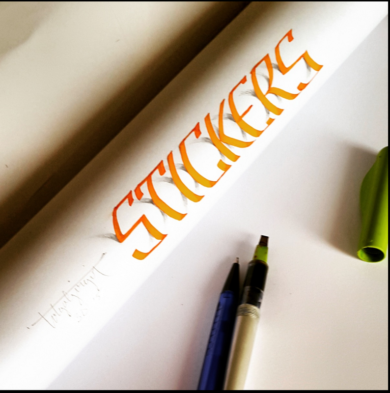
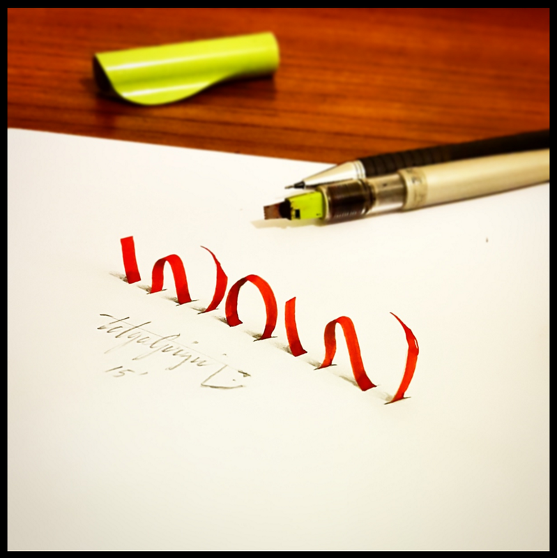
Awareness: Tolga Girgin
|
|
|
Tolga Girgin is a Turkish calligraphy artist that I recently discovered. I really love his style and method of doing what he makes. He does calligraphy (as I said before), but I took a look at his 3D calligraphy because I thought it was the coolest personally. Calligraphy is really cool, but it's very static sometimes, it is what it is. I think his use of form and space to make the letters look more 3D is phenomenal and a great way to do it. I like having technical precision in my work so all of his work makes me super satisfied because it's all neat and clean like I aspire to be. I got all my pictures and info from this link: https://www.behance.net/tolgagirgin99
|
|
|
|
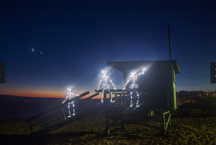
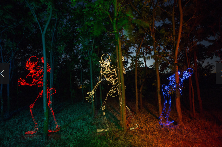
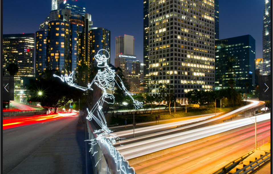
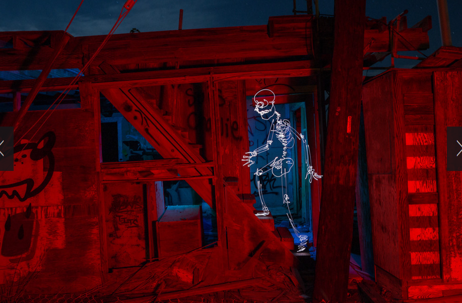
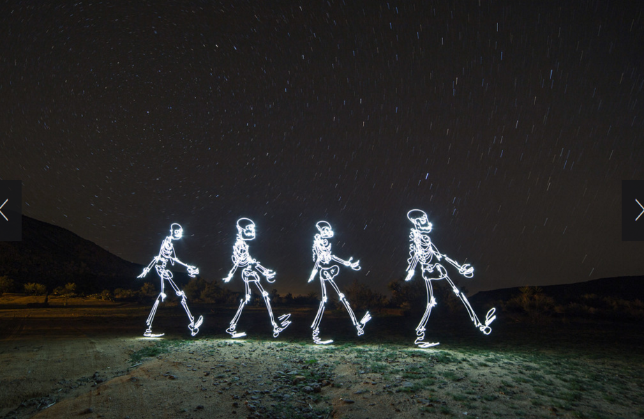
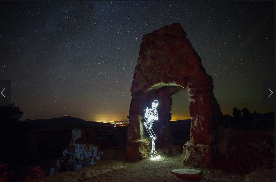
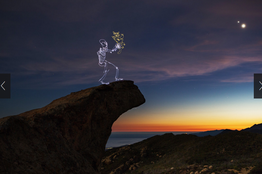
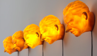
Awareness: Darren Pearson
I love this artist and his work so much. His work is super technically skilled and also very beautiful to view. He basically uses LED lights and super slow shutter speeds on his camera to create these super cool drawn laser-like photos with forms. He doesn't only do ones with skeletons, he does so many but the skeleton section of his website will always be my favorite so I'll focus on his work from there. I love seeing how he makes light, color, and form interact in the space and video he creates. I've linked the video and provided some thoughts on his photographs below.
Afterlife Guards
|
One thing I love about his work is the bit of joke-y nature he puts into it. Like the titles below are basically puns and I really love puns so they connect with me. Also, I love skeletons in any form so they resonate with me on a personal level. Also if you look at the two pictures directly below, they have a really cool use of light and color in the background of the photography in addition to the skeletons which has a really cool effect on the piece overall. And talking about the piece to the left, the weird fuzzy light effect really pushes the "Afterlife" idea he was going for as referenced by the title.
|
Hide and Go Sneak
|
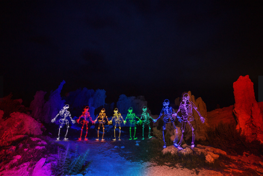
Rainbones at Mono Lake
|
Everyone is on the Grind
So another thing I really appreciate about his work is that it can have super interesting technical and artistic aspects even if it's really joke-y. Like the above work has really cool composition and lines going diagonally along with really nice balance with the lights in the background. It's a skeleton on a skateboard grinding a bridge fro crying out loud, but it's still really nice artistically. The photo to the top right is also an example. Those are skeletons having a cave rave, but they are placed interestingly and have nice movement in their forms and the colors in the background along with the cave have a very cool composition. Finally the embryo skeleton is just really cool and interesting with the light reflecting off the water and the central composition
|
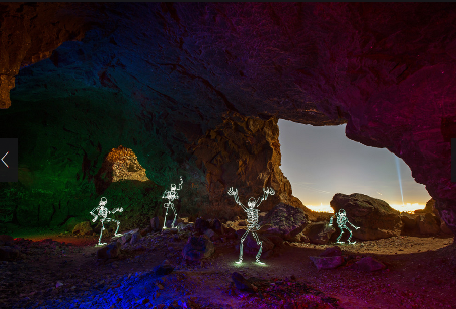
Cave Rave
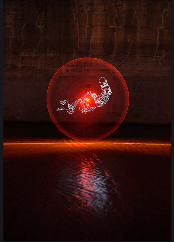
Embryonic
|
Nude Ascending a Staircase
Shabby Road
|
These are just some random thoughts I have on some of his work. The images to the left I think are hilarious because he's referencing a famous painting (top) and a famous album cover (bottom) but he's doing it with light and skeletons and I love it so much. The right pictures I grouped together because of two reasons. One, they have really cool backgrounds with the interesting rock and starry sky in the top and the beautiful sunrise and clouds in the bottom. Second, they are just so funny to me. I mean look at the first one, it's called "Hey Buddy" and is a skeleton seriously leaning on a rock looking like it's going to have a deep conversation with you. The bottom one is a classic scene from a great movie and it's just so funny and ridiculous I love it.
|
Hey Buddy
Circle of Life
|
Just to wrap up, some final thoughts on Darren Pearson and his work.
I think his process is super interesting and makes his work so cool because you have to be very precise and do it correctly to get it to work. I also love his backgrounds because they always are very interesting or beautiful and add greatly to the forms on the page. Speaking of the forms, he does stuff with aliens, angels, and much more but I really just love the skeletons.
I'm really in love with his ideas too, many of them are so funny and hilarious that I'm just instantly laughing or smiling. I think artists sometimes tend to take art and themselves super seriously and I love this joke-y fun vibe he's got going on.
Overall, he is definitely one of my favorite artists I have looked at recently and I really like his work. Maybe I can learn a bit from the "don't take yourself too seriously" route. I think that's a fair thing to consider.
Here is the link to his Gallery page for his skeleton work. If you are interested in his other work, you can click around and find it.
http://shop.dariustwin.com/Shiny-Bones
Experience "Art Seen": Yield by Hoss Haley
|
For a walking field trip, we went to see Hoss Haley's exhibit, "Yield." The video on the right is about his ideas and thoughts throughout the exhibit and it's super interesting to watch. I took some pictures and jotted down some of my initial thoughts in my sketchbook.
I thought there was a weird smell there, it seemed like it smelled like plaster or something like that. It was very machine-y and set a bit of a hard-to-place vibe for the rest of my experience. The piece I titled "Orange 3-Layered Broken Peanut" (Leftmost bottom picture) had a really cool texture/pattern on it. Like it seemed really machine-like and metallic, but the pattern was like wood, it was super organic. The floating metal orbs (Leftmost top and leftmost middle) I also really liked. I was drawn to the color progression of the orbs and how the singular red orb (rightmost top) was set aside with it's bright color. With the set of spheres, I loved how the shadows intersected with each other and how the light interacted with the piece. |
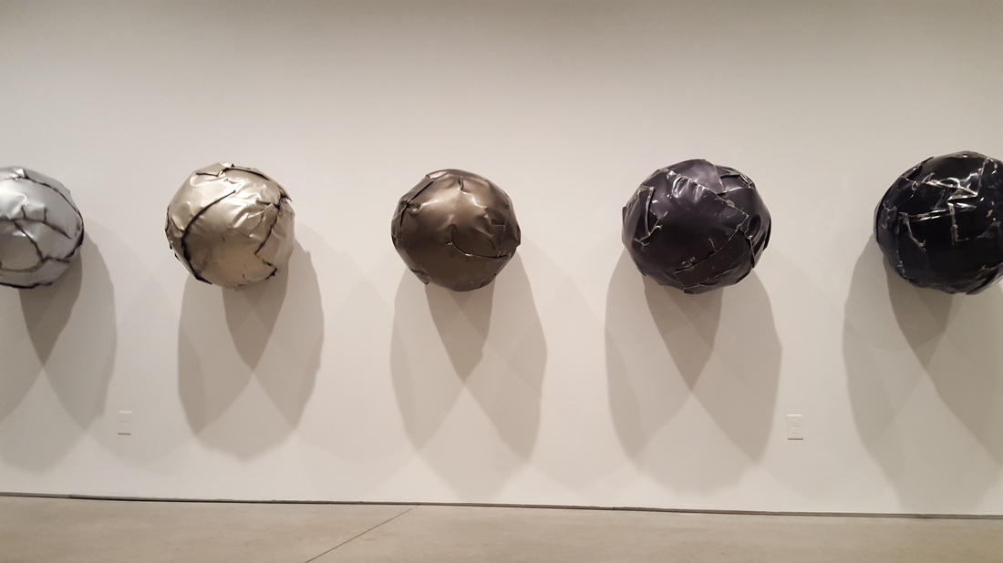
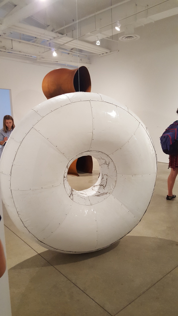

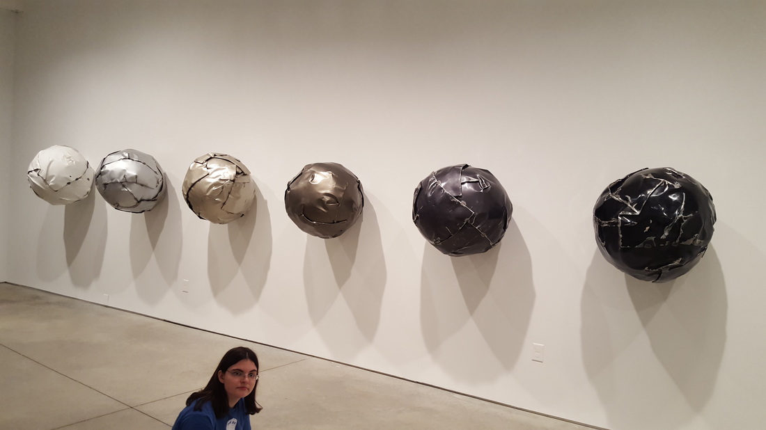
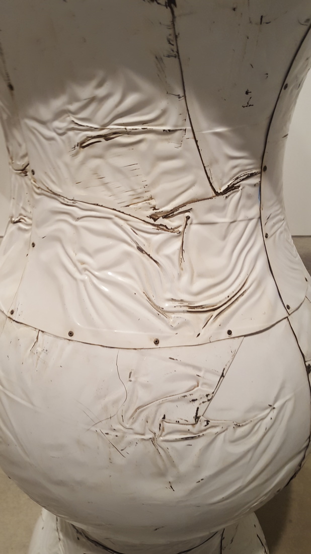
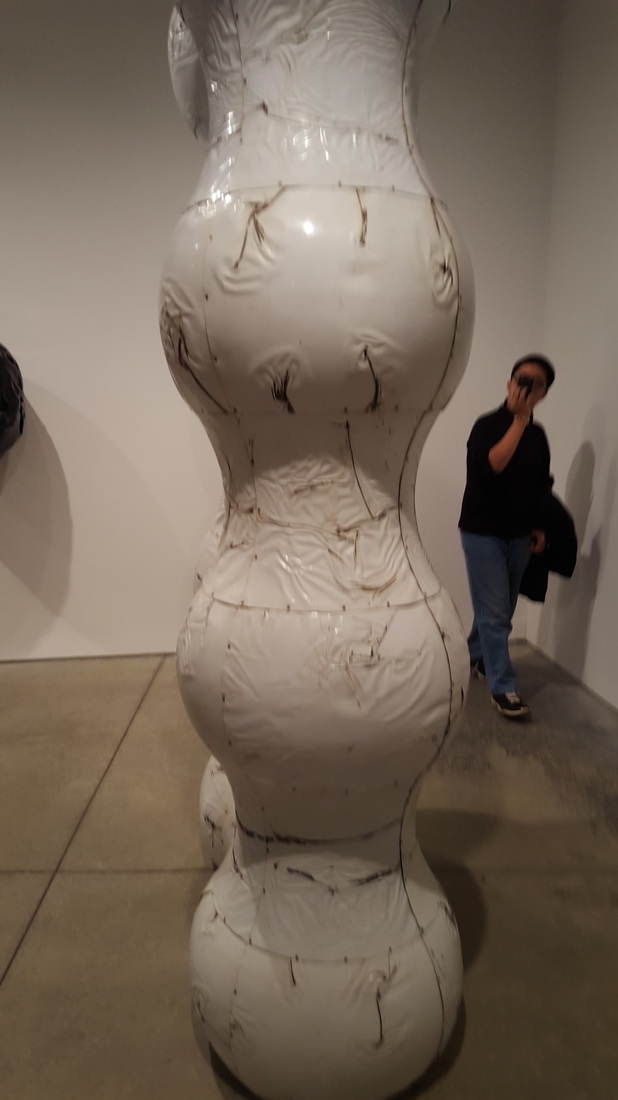
Overall, I really liked the work. I love the whole found-aspect/junkyard thing that was going on in the video, because I thought it was a neat trash-to-treasure kind of vibe. I also loved the whole vibe of the exhibit, it was kind of eerie, but still super cool.
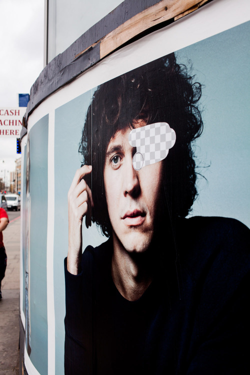
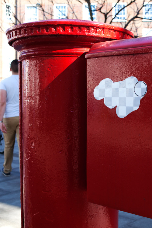
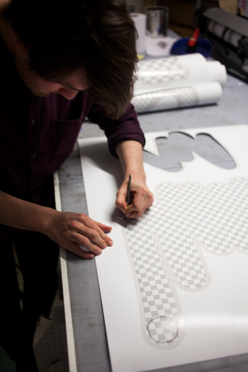
Awareness: Street Eraser

So basically, these guys put stickers on signs, graffiti, and other urban places in London. The stickers look like the classic Photoshop (or whatever photo-editing software you use) eraser tool and "underneath" the tool you see the alpha channel or clear backdrop of the layer. This really caught my eye because I love editing photos, but most of mine consist of face-swapping my friends or changing them into an Obama-esque Hope Poster. I use GIMP 2 to edit my pictures and the eraser tool is there too, and it does exactly what you'd expect, clears the area under it so you see the alpha-channel. I think this project is less about the actual art and more about the meaning of it.
|
The website says that the stickers reveal a covered world from underneath our own and I really like this idea. For me, the eraser in GIMP isn't just about removing an area, it's about uncovering another. Most of the time, there are multiple layers to an image and I use the eraser to remove a certain amount of one layer to reveal what's beneath. I like the idea of a secret world that we can't see right under the giant urban world they make their art in. Maybe it could represent how under all this hustle and bustle of city life, if you remove some layers, you're left with a blank alpha-channel, with nothing really on it. Maybe it's a commentary on the superficiality of city life, or it's a less skeptic viewing of the underlying peace/calm/connected blankness in all urban culture.
|
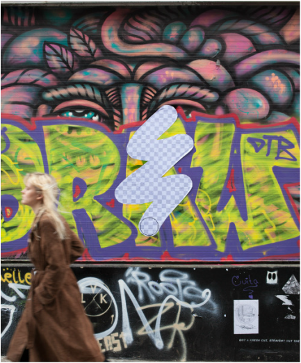
Or it's just to mess up the "classic city" archetype? The website talks about how the "digital tool interrupts everyday surroundings," which I find an interesting concept to consider. Could it be reminding us about the omnipresent influence of technology and the media in our lives, and how in our consumerist culture, anything can be removed or altered by the brush of photo editing? How the product, the person, and the place can be changed or deleted as seen fit by the overseeing eye of digital editing? One can see it that way, but why not look deeper into the layers. Personally, I think these works talk about the complex nature of all urban life, but connect it all back down to it's basics. Putting these stickers on signs, graffiti, mailboxes, anything that shows the intricate setting of the city removes it's layers. The stickers remove the cultural and regional characteristics from the area and take it to a base channel. Putting them all over the city connects all these seemingly different areas by one thing, their complex layers, or removal of said layers.
|
|
To sum it all up, these works really speak to the digital artist within me and make me think about the deeper meanings of how and why I make my edits. Maybe when I'm putting my friend's face on Iron Man's body, I can spend time thinking about the complex nature of the layers I'm removing or adding and what they mean symbolically. All jokes aside, these works actually really interest me because they're bringing digital art into the real world, and a particularly idiosyncratic characteristic of digital art too. Something that exists mainly on the screens pulled out into the streets really fascinated me and makes me think about what I can do with my digital art and how I can apply it in the "real world."
|
|
All the images are from here:
http://streeteraser.com/
And all the info I got was from here:
http://www.designboom.com/art/giant-photoshop-eraser-sticks-london-streets-03-21-2014/
That is all,
Akshata
Akshata
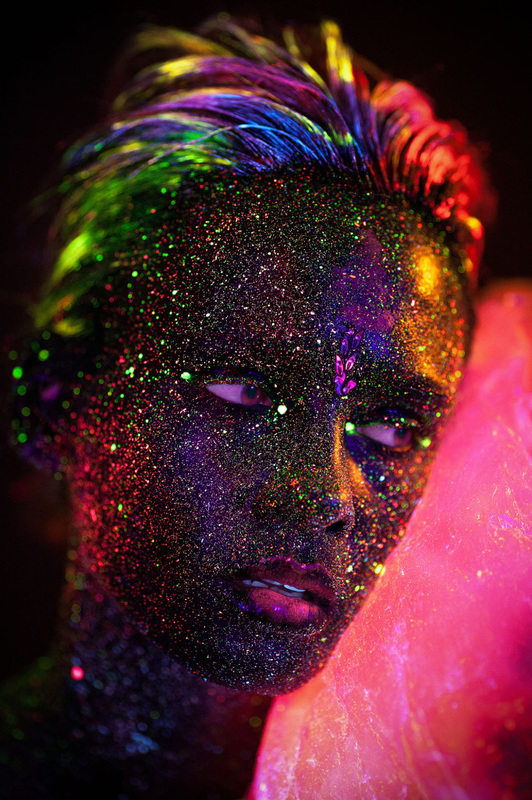
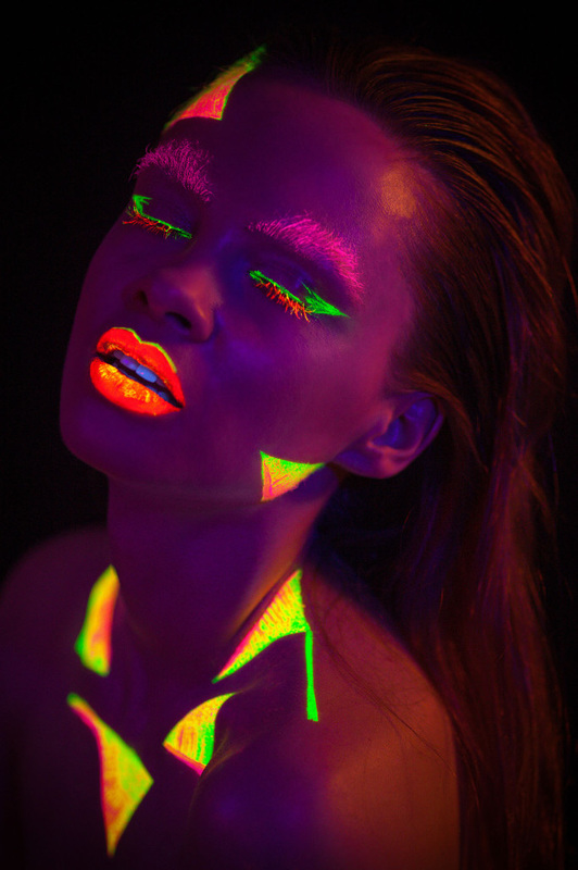
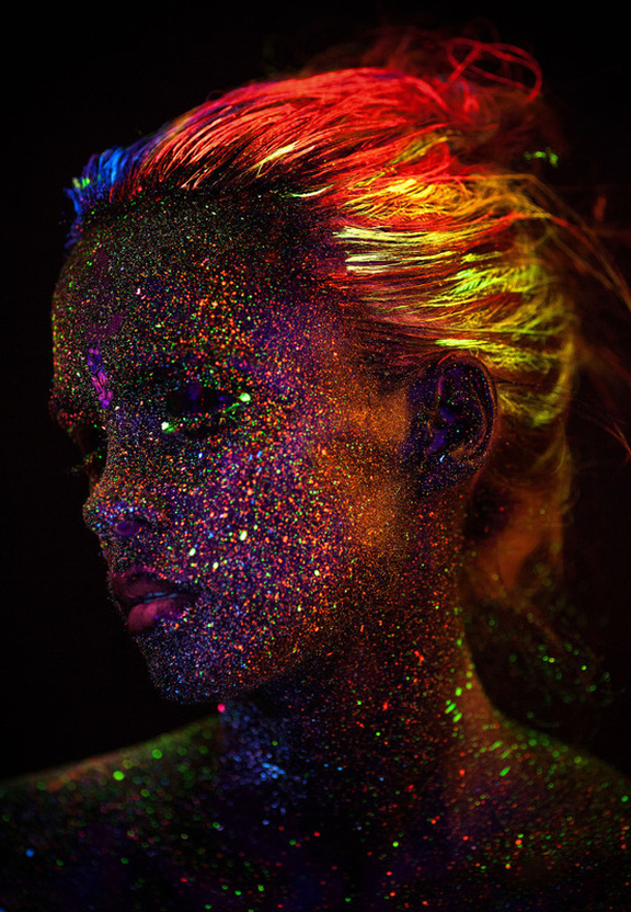
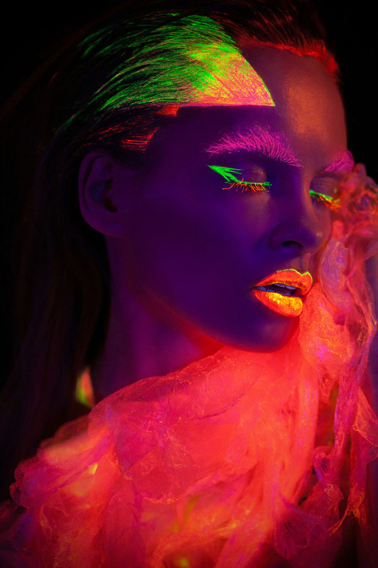
Awareness: Natalia Szura
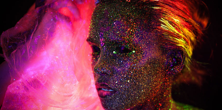
So these pieces caught my eye while I was just online and I looked a bit deeper into getting the source of the work. It's body art, which is something that I hadn't really considered as something I could maybe get interested in, but I definitely think it's really cool and I want to be a part of it. To make it even cooler, it's using UV light and paint to cause a glowing effect, like an interesting way to bring technology/science into art, which are 2 fields I'm really interested in. Also, this entire website is in Russian so I have no idea what this artist's message or point is, but I really like the works. That raises an interesting question about foreign art and language barriers that always existed, but I had never really thought about it before.
|
Aesthetically, Szura's works are just really interesting to me. The colors make me think about space and neon when they are painted as dots on the model's face or in her hair. Especially considering that this is in the dark and the UV is shining the light, the paint itself is the light source, an interesting twist. Also I like the colored gauze or fabric that's in the background, that makes the actual model less IN YOUR FACE and dramatic, and more soft and appealing, especially considering the ostentatious colors used. I love it.
|
|
|
Touching more on the UV and the colors, imagine being in the presence of these models, they'd look like goddesses with the cosmos painted on their skin, glowing in the darkness with bright colors. It really shows what modern art can do with all this new technology (okay UV light isn't that new, but it's not really used artistically a lot, or at least I haven't seen it). It's also an interesting facet to consider when making something. You could make it to be viewed in a classically lighted setting, OR you could make it glow and shut off all the lights. You'd have to consider how the colors and forms interacted with the darkness and what message that conveyed. It's just a cool new way to consider art an a whole bunch more stuff to consider when making it.
|
|
And despite the fact that the entire website's in Russian, I think viewing Szura's work has really been a great learning experience for me. I think this speaks to the fact that art is something that can transcend all cultural barriers; the color, form, composition, content, presentation, and so much more can convey great meaning or feelings. I have zero idea what her original thoughts were while making this, but I could still talk about it and analyze it without the artist's input, and that's amazing to me. Also it brings up the (slightly disturbing) point that we don't know much about artists outside of our own little bubble. This is really the first time (outside of school) I've come across a foreign artist on the web. Maybe it says something about our culture in how we only really focus on what we can understand or have access to, and I think that's utter garbage. We should definitely be looking out into the world to view art, how else can we see things as cool as this?
|
|
Anyway, some final thoughts on Natalia Szura's work. Her use of UV light and bright colors make the models look otherworldly, like ethereal beings, and their interaction with the dark negative space makes them almost fade into the darkness, to be pulled back by the neon decorations. The UV adds another variable into the mix of making and analyzing art, making us focus on the correlations between the darkness and the foreground and making our piece more impact-full by playing with light (or lack thereof). Finally the language barrier created by international art should not stop us from going out and finding cool foreign work, and even if we can't understand the artists' intentions, we should try and think about the work as hard as we can despite that one gap. Natalia Szura's work with these models and in this medium is amazing and I'm really looking forward to seeing if I can incorporate light play or UV into my works in the future.
All of the work can be found here (warning: Russian):
http://krkstudio.pl/ultraviolet-natalia-szura/
That is all,
-Akshata
All of the work can be found here (warning: Russian):
http://krkstudio.pl/ultraviolet-natalia-szura/
That is all,
-Akshata
Experience/Art Seen: George Ferrandi
I didn't get to go to the lunchtime lecture, but I took some time to research her work online and I really liked her "It felt like I knew you" piece. Basically, the idea was that she went on trains and fell asleep with her head leaning on people next to her. In her mind, she changes the space from one between stiff strangers to one between warm friends. When she's done that in her head, she lays her head on their shoulder, envisioning them as a friend. I really think that this is a cool idea, because it takes the awkwardness of the train ride home to a completely different plane. It's like she's trying to make things awkward for the people around her, but she's really not because she's trying to turn a hostile place into a friendly place. I also think this really speaks about the people she puts her head on, because some of them just stay there until she stops and others have more interesting responses. Some people get up and leave or look angry, while others smile and talk to her when she "wakes up." I think this is really cool because the people who shun George you can look at as mean or rude, but you can also look at them as people who've had a long day that don't want to deal with this because they're tired. Also, the people who were nice about it are all different so you can see how kindness transcends all bounds. Finally, I thought that this was cool because it's not what you would traditionally consider art, it's more like a psychological experiment or study. But on the other hand, it's a bit like performance art. It's like a grey area that I think is really interesting to explore because it's still creative and makes a point, but it's not traditional art.
That is all.
- Akshata
That is all.
- Akshata
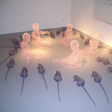
Awareness: Benedetta Mori Ubaldini
|
So we are learning about sculpture and using 3D space in art and I came across this artist online. Most of her work is made with chicken wire and then shaped by hand and twisted to make forms. She says that she loves to fill spaces with narratives and create symbolic works. She talks about how her sculptures have no internal structure, they're just a wire external frame, and how that relationship between "presence and absence" makes the work magical and gives the sculptures a ghost-like feel, "like a trace from memory or images from a dream.”
|
|
Looking at her work, you can clearly see what she means when she talks about the pieces not having internal structure. Most of them are just the wire in different colors wrapped and twisted to make a form. I thought this was really interesting because we started learning about sculpture in class and this is another way to think about the process. Creating an external form out of wire and installing it is a great way to play with the space. Especially so, because the piece becomes very lightweight, making it easy to move or position in a certain place. Also, as Ubaldini said, working in this medium gives the sculptures a really dream-like surreal look. They look like creatures floating in memories, barely existing, not full versions of themselves. The pieces really play on the positive and negative space of the forms themselves, because the main form is negative space held together by a wire frame. I just thought it was a really cool approach to sculpture and that maybe I could use it for inspiration when we begin working on this unit.
|
|
All the work and Ubaldini's profile can be found here: http://www.benedetta.info/
That is all.
- Akshata
That is all.
- Akshata
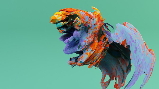
Awareness: Mike Pelletier
Click on the image to see a video about the work.
This artist's main medium is digital art and I think he takes the concept of sculpture to an interesting level on the computer. For example with his piece "Time of Flight," he took 3D scanned portraits and changed them around using digital editing software. I think that's really cool because you can have a 3D work, and then you can manipulate and change it around using technology to see how it evolves. In the video, the colors and forms are distorted and changed by the animation software, greatly changing what the main piece looks like. Also, sometimes the piece can have a certain flow to to that you can't get in a plain sculpture or traditional art. The digital element gives the piece a sense of movement, literally, as opposed to us talking about the principle figuratively. The colors and shapes move through the space and interact dynamically with each other. I just think that's really cool because it's really interesting to see the work be manipulated by the computer software, you can see it evolve and change as the video goes on. Also it really shows how technology can influence art and take it to the next level, because we can clearly see the 3D forms, but with the software, we can see them move and interact.
That is all.
- Akshata
That is all.
- Akshata
Bruce Riley
Links to his works: https://www.flickr.com/photos/17036157@N03/sets
I just think his artwork is really, REALLY cool. The way he drips the paint onto his canvas and it spreads to make such a cool pattern. Plus, his process looks so fun and an interesting with the cool materials. Finally, I love his color schemes, all the colors he uses are really good at interacting with each other.
That is all
-Akshata
National Gallery and other museums in dc field trip (i didn't go)
Here's some pictures from the art Museums at Washington DC. I didn't go on the field trip, so I couldn't see them up close, but I tried to find ones I liked online. All the pictures are links to the online site.
|
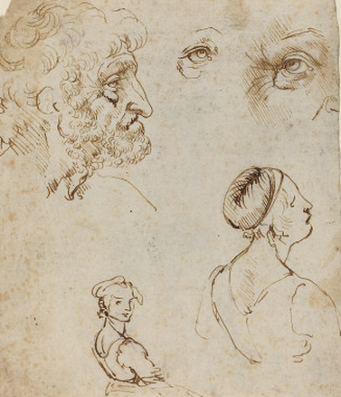
To the left is a picture of some sketches of Leonardo da Vinci from the NGA. You can really see his hatching mark like I saw people emulating during our Old Masters' project.
|
|
To the right is a picture of a Landscape near Paris by Cézanne from the NGA and it's an oil on canvas. You can really see his brushstrokes in the sky and the grass of the landscape.
|

|
|
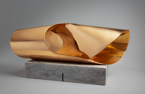
Finally, to the left is the Endless Ribbon from a Ring I from the Hirshhorn Musesum. This part of the assignment was supposed to be a painting, but I couldn't find it on the website so i picked a sculpture. It looks really cool and the shadows of the copper make it look very interesting in the light. You can really get a sense of movement through the piece as your eye wraps around the ribbon.
|
That is all.
- Akshata
- Akshata
Awareness - JBAK
Above is a link to Addison Karl's website with his works and mission
|
So JBAK is basically a duo made up of James Bullough and Addison Karl, who combine their almost completely opposite styles to create balance and harmony to add life to their canvas in their murals. They live in Berlin and use their shared love for art, culture, travel, and urban societies to make their artwork with a "cohesive theme of unity and humanity."
|

Above is a link to James Bullough's website with his works and mission
|
|
One thing that I really like about this duo is that they are so open to working with other people. If you look at the video to the right, they talk about how they love working with other artists and they don't care if people work where they were going to make a mural. They love the opportunity to see how other artists make their work and learn from them.
The video also talks about how JBAK is about painting people, to get their image out into the world in a place they might not be. The two artists talk about how they'd like people to see the huge images of their subjects on the wall and maybe even get the person they painted to see it. |
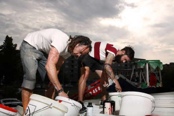
Above is the link to the official JBAK site with information on the project and the people involved. At the bottom of the site, there's a video where Karl and Bullough talk about their process and their mission.
|
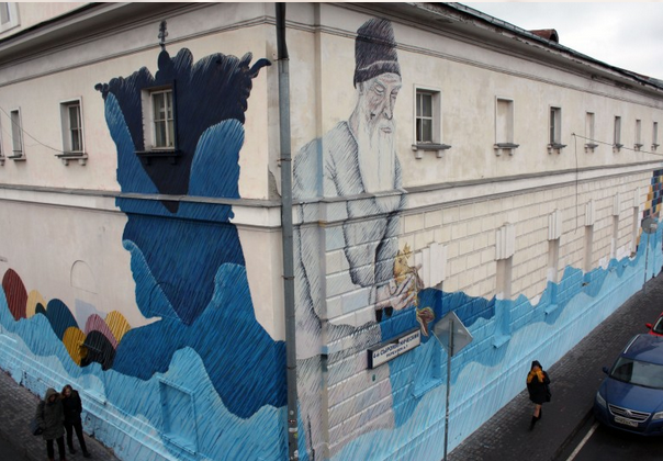
This is an example of some of Karl's work. This one's called "The Fisherman and the Fish" and it's in Moscow, Russia. Clicking above will take you to his website-blog with more of his work
|
One of the main parts of Bullough's and Karl's process is trying to meld their separate styles together into something harmonious. Bullough's work is very photo-realistic, in which he draws inspiration from the Dutch Masters. On the flip side, Karl's is made with a hatching style, in which he uses fine likes to make details and the big picture. Their styles are so dramatically different from one another and they are always looking of new ways to mesh together in their murals to get their point across.
|
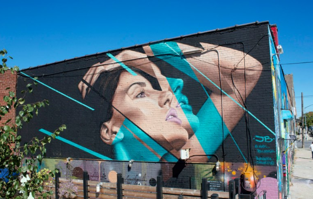
This untitled mural is an example of Bullough's work in Brooklyn, New York. Clicking on it will take you to more of hi murals.
|
|
JBAK's main point is to utilize the space provided by the place they're making the mural to draw attention to that same space and the people that live within it. They don't want to alter or change the space, but their goal is to add to it and meld their art into the environment to make balance. It truly adds life to a sometimes bland scene when they paint their huge, colorful images of people onto walls in the city. These large paintings actually emphasize the difference between their art styles, making people think about the environment they live in and the people they interact with.
|
"to give people a reason to look up, around, and beyond themselves.
|
I really think that James Bullough and Addison Karl have a really interesting and great system going on here. They're so different and yet their art is a combination of the two styles into something really beautiful. I love that they are trying to work with each other and other artists to learn new styles and make their own work better. I also love that they're using the giant murals to bring people's attention to each other, the world, and themselves through the details, color and sheer size. I'd really like to go see their work in person, because looking at work online isn't as good as seeing it in person, especially giant murals like these. All my information, I got from links in the pictures, and I highly recommend looking at both of their individual websites and the official JBAK one.
That is all. - Akshata |
Awareness - Chihuly
|
Above are some pictures of his installations
|
So there's this glass blowing artist who's work I think is amazing. I don't know what the allure of glass blowing is for me, I just love the organic shapes and colors involved. Also, the process is so interesting, you have to heat it, blow it, and shape it into what you want. His art is just so organic, pretty, and flow-like. In addition, some of it is also functional, with his baskets and other works. Finally, I love his giant installations, they're so colorful and just BAM, there. I just really like glass blowing, okay?
I got all my pictures and inspiration from: http://www.chihuly.com/artwork.
That is all. - Akshata |
Above are some pictures of his works that I found interesting.
|
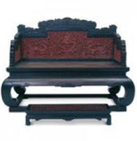
Art Seen - Forbidden City Exhibit at the VMFA
|
On Monday, we went to the Virginia Museum of Fine Arts to see the Forbidden City exhibit. It was mainly about the art, architecture, clothing, furniture, and other items that were made and transported through China during the Ming and Qing Dynasties. It was really cool to see such intricate and detailed art from old Chinese Dynasties. One of the coolest things was the furniture of the Emperor, it was like a chair, but it had so much importance and detail.
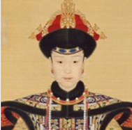
This is a portrait of Empress Xiaoxianchun, whose husband was Qianlong in the Qing Dynasty. In the painting, she was on a dragon throne and detailed robes, gazing at the viewer. It showed how wealthy, beautiful, and perfect she was.
|
This throne was in the Palace of Eternal Longevity and has many dragons that symbolize the emperor leading the people
Other cool things were seeing portraits of important rulers because we learned about them in class and it was really cool to see their faces. The portraits were really detailed and it makes me think if they actually looked like that, or if the person commissioned to make the painting had to paint it perfectly or else they'll get in trouble.
|
|
Also, I love the cool combo European-Chinese art that was there, it was a really good blend of Western and Eastern cultures. Some of the clocks that we saw there made me think of how one of the emperor's loved collecting clocks of all different types because he was interested in the way they moved.
|
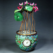
This clock was made by Chinese artisans under European engineers and when wound, the lotus petals open with human and animal figures.
|
|
Finally, I thought the trip was really fun to go see work that fits in the context of the history we learned in Global Studies. I'd like to go and see art from other places like Latin America and many different places in the world. It really makes me think because a lot of the art we're exposed to is Western art from Europe and America, and I'd like to see different artwork. This was an amazing trip all in all and I'd love to go see it again.
That is all. -Akshata |
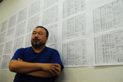
Awareness - Ai WeiWei
|
So there's this artist named Ai Weiwei who's artwork is so provocative (not in that sense though). Provocative in the way that it makes you think and look closer and it's so startling at first, like why would anyone do anything like that? Well a lot of his work is making political statements about his dissatisfaction with the Chinese government and their censorship (along with other things).
The image to the right is his list of names of the children that died in an earthquake. The government refused to put out the names and death toll, but Weiwei searched and talked to families to compile this list. I think he is great, I mean I'm a lot like him. I will always try to correct injustice by creating a message and helping people. He isn't scared of what people think, he continues with his Twitter and other stuff, even though he was under house arrest at watch by the gov't. I think that's why I admire Ai Weiwei so much. He stands up for what he believes in and tries to help people, regardless of the consequences of portraying his message. One day I want my creations to make a huge impact on the world and I don't want to be restricted by what might be the results. Anyway that was just my brief thoughts on Ai Weiwei and his political artwork. I love that he makes a message with his art. That is all. -Akshata |
Click above for more information
|
Art Seen - Bob trotman
|
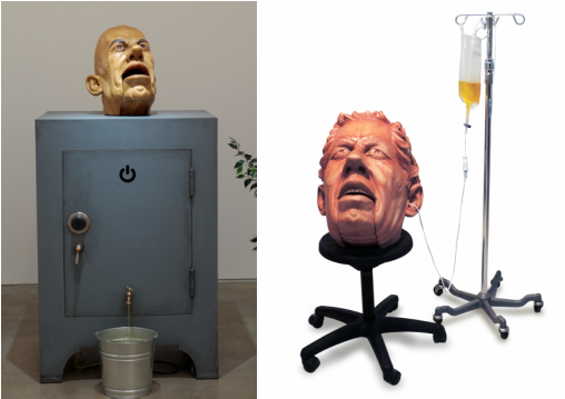
Okay so on Wednesday the 10th of September, we went on a walking field trip to the Visual Arts Center and saw Bob Trotman's amazingly cool exhibit. It was a series called Business as Usual and it was a whole bunch of wooden puppet-like business men that had like angry or anxious expressions on their faces. They had like sounds and liquids and moving parts, so they weren't just like sculptures or non moving things. It says on the website that Trotman was trying to poke at the source of corporate power and how it plays a role in our lives.
Okay so some general thoughts, this is like very unsettling. There are so many noises going on at once like ticking or drum beats or people talking. They were all out of sync but the statues were all so creepy it was really weird in general. They all look kinda similar to each other but, you can't really tell who they are. They also all look worried or upset about something, even though they had angry, corporate faces. Maybe they are corporate evil doers, but they are puppets of the bourgeois elite. Also supporting that theory, is the fact that they look like marionettes. I like that idea I'm gonna role with it. SIDENOTE: Look how CREEPY these lights are. Look, if we were in a horror movie and that was the only light, do not tell me you will be just a bit perturbed. I would be so scared they are the creepiest things ever. |
|
|
Okay so I did have some questions to think about after I left. What do the liquids represent? Because there are just a whole bunch of liquids connected to some of the pieces and I have no idea what they are or what they represent. Maybe they're the lifeblood of the corporations or something, I don't know.Okay this guy on the left is so creepy, like it doesn't look like it now because there's light, but when we went, it was dark and he was scary. Basically, his mouth opens and his head spins around a bit while you hear stock market noises. Then his mouth closes with a big THUMP and the stock noises stop. Also, there's liquid that flows out of the safe into that bucket. Him and the guy on the right are examples of pieces with liquid and I have no idea what they are or why they are the way they are.
|
|
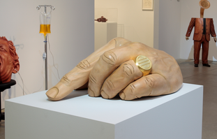
So other questions, why all the noise? So many like noises of videos and people and tick-tocks and other noises. Is it to purposefully unsettle people? Because it works. One of the coolest pieces here is this giant hand that goes *tap tap tap* and it's great but also so creepy. Like is he tapping because he's upset or impatient, or is it because he's nervous or scared?
|
|
So just really some final thoughts to finish up. My main thoughts are just that it was extremely cool, like great workmanship and stuff. It was just also so creepy and unsettling. They all had slightly creepy, but also looked nervous or anxious, like maybe the corporate business man is just a puppet of the greed brought on by the whole Capitalist dream. It also made me think about how art can be used to convey messages and how different types of art can convey different messages. Like, why do I respond so well to creepy, unsettling work? I love Poe's stories and the questions they raise, but I hate horror. Why is this a thing about me? I think that this was a great field trip because it not only made me think about the art work and the pieces, but maybe more importantly, it made me raise questions about myself.
Anyway that's it, I got all my pics and info here <http://visarts.org/exhibitions/current-exhibition-programming/> as well as the art gallery itself. It was a great experience.
That is all.
-Akshata
Anyway that's it, I got all my pics and info here <http://visarts.org/exhibitions/current-exhibition-programming/> as well as the art gallery itself. It was a great experience.
That is all.
-Akshata
