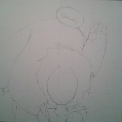
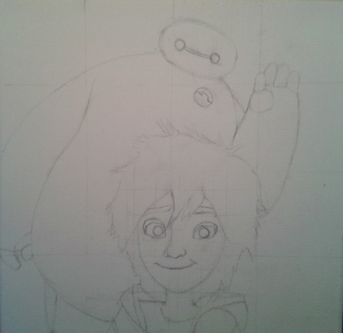
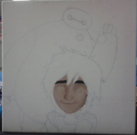
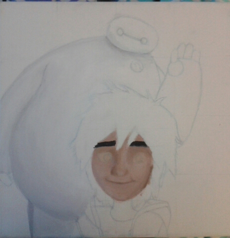
*I promise I'll start doing updates with these pics every week instead of just taking pictures every week and uploading them all at once. I'm still getting into the swing of updating this weekly*
0 Comments
Protest art is most often made by people who are protesting a form of injustice or an important matter. You rarely see famous celebrities or people in positions of power making protest art, mainly for the reason that there isn’t anything for them to protest. Art like this is mostly made by minorities or oppressed groups, whether they are oppressed socially, politically, economically, or some combination of all those, and the subject of the art is usually related to their lack of equality.
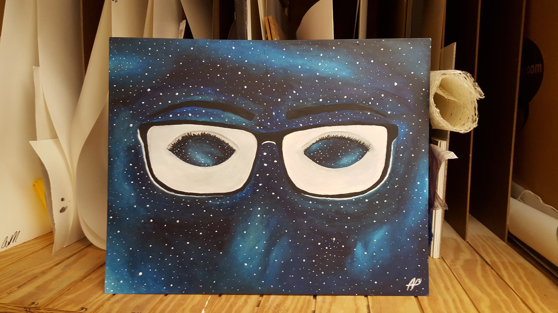
For example, the Guerilla Girls make their art about the inequalities that women and people of color have in the art world (Reading 2). Or the art based on tradition from Mexico (Reading 1); a large portion of protest art is made by the oppressed about their oppression. You can argue that in a lot of circles, protest art is seen as “lesser” art, or maybe not as important art. Could this therefore stem from the fact that most of tis protest art is made by people not in positions of power in society? Another related example, street art was usually made by poorer artists making statements about their situations, and it wasn’t seen by too many as “high-brow art.” However when a rich, white, British man called Banksy started making the street art about the same economic injustice, you can see a shift in the viewing of street art. Everyone sees Banksy as an eccentric and cool artist, but does that have anything to do with his status? Going back to the subject of the discussion, you rarely see the bourgeoisie making protest art. This could be a big reason why so many people think protest art is inflammatory or not as good as other types of fine art. This isn’t a generalization, there are always exceptions and Maggie Walker can possibly be considered one of them, but protest art isn’t always treated with the same in depth discussion and worth that students here treat it with. To conclude, protest art is made by, for, and about people who are protesting injustice or inequality. People protected by and who benefit from the status quo are not making protest art most of the time. This lack of involvement from the people in power could be an evident reason to why protest art is not seen to be “as good” or “as important” art. This points out a fundamental flaw in society and the art world, about how artists like The Guerilla Girls and others who are trying to spread their message about inequality can be (and are) treated unequally. (The final image is in the gallery page)
 This is when I just finished the painting and now it's all dried. The final picture will be on the gallery page. I definitely want to work more in oil and possibly make more still lifes. I don't know if I'm going to do this at school or home, but I will do more of this. I really like oil paint overall, it's amazing to mix and make colors with and just painting with it is great.
- Akshata 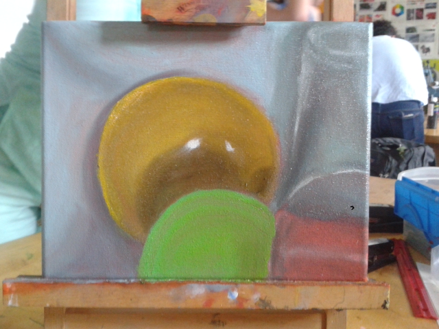 I started using the smaller brush to do details and it's so amazing, the small brush is a life saver. I'm also happy with the glass, because it looks like glass and it's see through. The container is better saturated and fit with the color, which is great. I need to saturate the background fabric also. I need to paint over that under-paint play dough container in the corner. In addition to all of that, I need to just fix details and stuff. I do not think I can finish the whole project
- Akshata I used to absolutely hate figure drawing and drawing people in general because I was so bad at making the proportions work and make it look realistic. I thought they were boring and I generally had negative feelings towards figure drawings. After all the practice I've had this year I really enjoy figure now. It's relaxing and it makes me think and observe. I don't think it's boring anymore either, because I have to go through and decide how to make it and what mark to do and how to set up my composition. Especially in regards to color, I have to figure out which colors to use and how to use them. All those things I didn’t know how to do before and that made me kind of hate figure drawing in general, but now I’m really enjoying it because I know how to do and work on some of that.
Speaking of that, I think there are still a plethora of things to improve on for me. Mainly I think time is one of them, getting the main shape and shadows of the figure down quickly so I can work on shading and color. Also I need to work a bit more on proportion, it’s better than it was before, but there are still little details I need to work on. Little details in general are things I need to work on. Other than some of my shortcomings, I have definitely improved over the year. I think color and making my figure drawing interesting is the main thing I’ve improved on. I know how to fill the space and make my composition interesting and after that, I know how to consider color and mark to make it less, for lack of a better word, boring. All of the stuff that I’ve learned is extremely useful in terms of my career in art later on. I’ve noticed that I’ve gotten a lot better at observational drawing, as in I can look at something for a while and draw it semi-realistically. I also think it’s really useful because I am better at seeing light and shadows in real life now, so I can make it more realistic when drawing because I can try and capture the light. Specifically, with our oil painting still life, I know how to observe and look at light, color, and shadows. I’m extremely glad that I’ve done all this practice over the year and I’m really happy with the figure drawings. 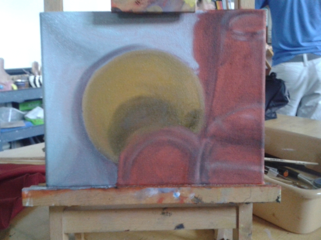 Another oil paint update from the last week. I've mixed colors to make the background and I think it's going pretty well. I think I have to work on layering and glazing, so applying paint in thin layers and not using that much pigment. It's easier to do that than it is to make the exact color with paint because you can layer close colors until it all becomes correct. Also I need to work on that drop shadow just to the left of the yellow bowl, that doesn't look correct. Speaking of shadows, I need to fix the color of that larger shadow of the container in the bottom corner, it's darker because there's also a fabric fold there. I need to work on making that color correct because this is a bit off. I'm worried about the glass because I don't know how to make it look like it is glass, like make it look all see through and stuff. Also the details in the clay container and the straight highlights are something I'm worried about, but I'll figure that out when I get there. That is everything for this update, I'm still really liking oil paint and it is really fun.
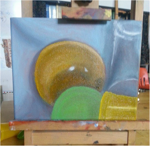
- Akshata 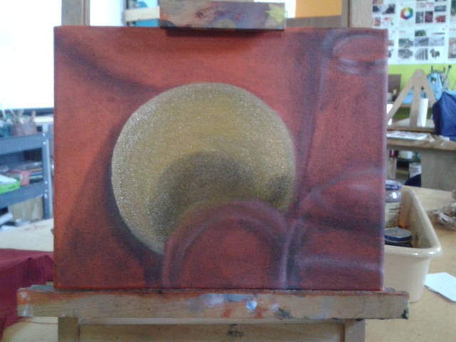 I've finally added some color and it's so difficult. The yellow is not anywhere close, it looks too green and I think that's because of the orange background pushes out the blue. I need to work on that. I should have probably done the background fabric first to make that better. I mixed for many many minutes to get that perfect background color, but I finally did it just when we had to clean up. I'm ready to paint more even though color matching is extremely difficult.
Akshata
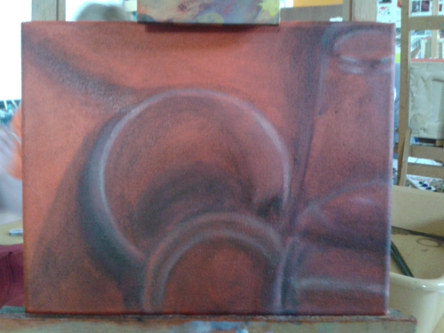
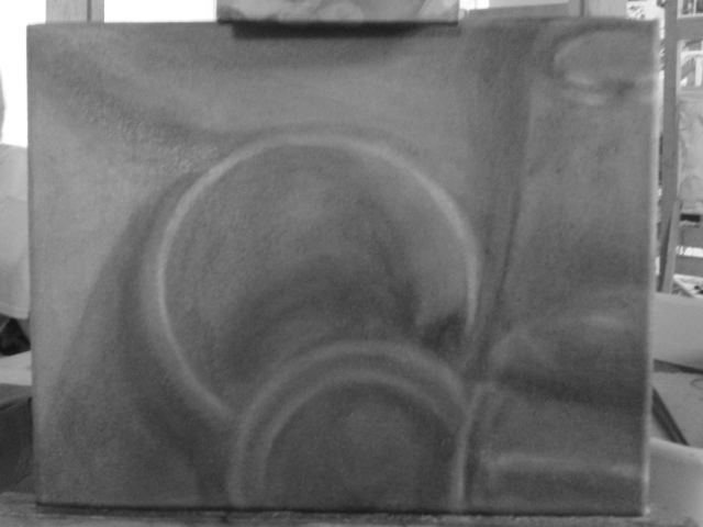
We had our 3 hour art block and I think I made a bunch of progress. The above are the same thing, but the one on the right is a black/white filter I took just to look at the values. I did more than this, but this is one of the process shots I took today. I think my values are a bit off, but they can work well enough once I get the color started. Also I think I made the glass better in the top right corner (still my favorite part of this painting.) The lid of the clay container is a bit wonky and I need to fix that up, but it's okay. Also I've completely ignored the polka-dots, I'll get to that with the color. That is everything for that update, I have another one with some color filled in.
Akshata 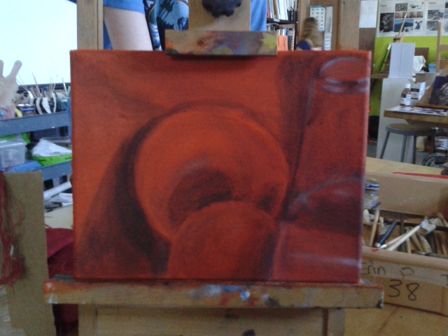 This is what the painting looked like Friday and I think I've made a lot of progress. I've darkened much of the background and foreground along with making the darker parts in the glass look more like light is going through the material. I've also realized the shadow behind the large circular bowl changes as with the light and stuff and it's hard to nail down. I'll have to try to make that work out in the long run. Also the container and an the cup seem to move around a lot so I always have to try and re-angle them along with fixing the fabric folds (which are easier because there's only like 1 fold in the composition).
It's also visible that I've started adding white to the highlights in the still life and It's actually pretty difficult. Most of the highlights are very thin and precise lines of reflection so I need a small brush and fine detail. Despite that I think I got the top of the glass really well (that's actually my favorite part of the whole painting except for maybe the fabric fold). I think I need to fix the highlight on the bottom curve of the glass because that is REALLY thin and precise so I need to work on that and the shadows around it. The same thing goes for the highlight on the container in front of the glass; I need to tighten the highlight and make the container look like plastic. I think I also need to start focusing on the details like the ridges on the container and it's lid along with the reflections in the glass. I've also started considering the polka dot pattern on the fabric; the dots are slightly darker than the surrounding fabric so I need to get on painting them in correctly. That is mostly all for this week, I'm really enjoying the project still and I'm super excited and scared to start coloring. Akshata |